Designtuitive.com
InDesign Guides
InDesign Jargon Buster
300 dpi
Stands for 300 dots per inch. This is shorthand for saying that an image needs to have 300 dots per inch resolution in order to be sufficient quality to be commercially printed. In the Adobe products this is known as PPI – for Pixels Per Inch, but it stands for the same thing. Use InDesign’s Links Panel to determine whether an image has enough pixels per inch to look good when printed commercially. See also Hi Res Image, below.
Bitmap Image
A bitmap image is an image that’s made out of pixels. When you take an image with a digital camera, it breaks down what’s in front of it into thousands or millions of pixels, which you can think of as tiny squares. Each square can have its own colour, and so if the squares are small enough, you can capture the complex range colours and tones, say, of someone’s face. File types such as jpgs, pngs and psds are all bitmap file formats.
Bleed
When something is being commercially printed, it’s often printed on larger paper than the final document will be, and then trimmed down to size. When it’s trimmed down it’s possible that the trim might not be 100% accurate, and elements that are supposed to print all the way out to the edge of the paper might not do so. To prevent this, such elements are made larger so that they “bleed” over the edge of the page. Read more about bleed in our guide to preparing InDesign files for commercial printing.
CMYK
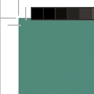
Cyan, Magenta, Yellow and blacK (CMYK) are the four inks that are used to print most things you’d come across that have been printed in large quantities, like newspapers and magazines. They are also described as Process Colour or Four Colour Process. So when you’re making something that will be printed you’ll use colours that are combinations of different percentages of CMYK inks (as opposed to RGB, which mixes combinations of Red, Green and Blue light). Notice in the image below that InDesign indicates whether a swatch is made from CMYK or RGB by both its (default) name, and the icon on its far right:

Gutter
A gutter is the gap between columns.
Hi Res Image
Resolution refers to the number of pixels per inch in an image. The higher the number, the more pixels there are in a given inch. You need around 300 pixels per inch (see above) to ensure that an image will not appear pixelated when printed. Hi res is shorthand for that quality (lo res is shorthand for low quality).
.indd file
An indd file is InDesign’s “native” file format. Which means when you save a document created in InDesign, this is the file you’ll get by default.
InDesign package
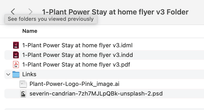
An InDesign “package” is used when you want to send someone everything you used to create your design. It contains not only the .indd file but also a pdf file, and any (non-Adobe) fonts or images you used. If you’ve asked for your designer to send you the InDesign files they used, this is what they might have sent you. Below is an example of an InDesign package. Note the images are in the Links folder:

Kerning
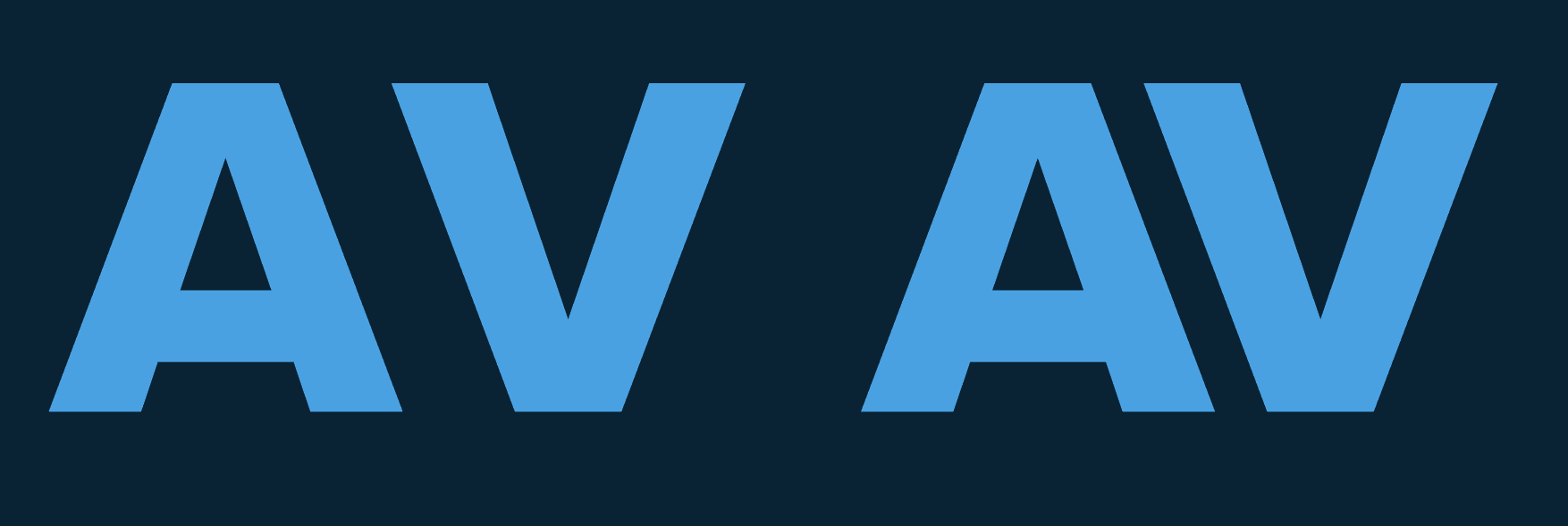
Kerning is the space between a pair of letters. If you imagine a really large heading on the front of a newspaper or magazine, it’s likely that some of the pairs of letters have been “kerned” to make them look better. You can find kerning in InDesign's Character panel (Window > Type and Tables > Character). In the example below, the space between pair of letters on the right is tighter because negative kerning has been applied:

Leading
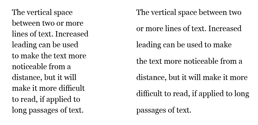
The definition of leading is the vertical space between two or more lines of text. You can find leading in InDesign's Character panel (Window > Type and Tables > Character). Increased leading can be used to make the text more noticeable from a distance, but it will make it more difficult to read when close up:

RGB
Everything that you see when you look at a screen, whether a TV, tablet, laptop or mobile, is generated by a mixture of red, green and blue light. So when you’re making something destined for the screen you’ll use RGB colours (as opposed to CMYK, above).
Serif
The text you’re reading now has serifs – tiny lines that help visually anchor the text. The text in the subheading does not. If you compare the two, you might find one easier to read than the other. Generally, texts with serifs are determined to be easier to read in small sizes when printed, whereas for on-screen use text without serifs (sans serif) are often used instead. Sans serifs are likely to be used for headings, whether in print or on screen.
Tracking
Tracking is a little like kerning (see above). But whereas kerning applies to the space between a pair of letters, tracking applies to the space between the letters on a whole chunk of text. This can be used to make the text more noticeable, or more easy to read, or fill up more or less space.
Trims
These are thin guidelines that are placed around the edge of a document so that it can be cut down to size after it has been printed. You can add them when you create a pdf from InDesign, or the printer can add them in later. The pdf, below, has been created for commercial print – notice the trims around the edge:


TypeKit fonts / Adobe fonts
Typekit (now called Adobe Fonts) is a service that you can access if you’ve got a Creative Cloud subscription. It allows you to find and use fonts that otherwise you’d often have to buy.
Vector
A vector graphic is an image that's made using anchor points. Unlike with a bitmap, whose pixels have a physical size, vectors use anchor points which are defined mathematically. This means you can make a vector many times larger and there will be no loss in quality – which can not be said of a bitmap image. If you think of any logo that you're familiar with, it'll be designed (in Adobe Illustrator) as a vector graphic, for that reason.
Read our other guides to InDesign
Explore our Graphic Design for Marketers course

