
Designtuitive.com
How to prepare Indesign Documents for commercial printing: a comprehensive guide
This page contains a long, detailed guide to the pitfalls of commercial printing and how to navigate them using InDesign. Read it all if you want to understand the why as well as the how of setting things up for print.
Alternatively you can watch the "Preparing InDesign documents for commercial printing" module from our flagship Graphic Design for Marketers course for free. This gives you access to the documents I'm referring to – that you learn to design on the course – as well as access to the whole 25 module course for 7 days.
About Commercial Printing
Commercial printing is so called because money is involved, obviously. You'll most likely be dealing with a company with one or more large, expensive printing machines, as well as other specialised equipment used in the industry. Because it's an industry there is some jargon, and the more you learn about it, the easier it is to navigate.
Here's a picture of an offset lithographic press:

Like an injket printer, it applies the four process colour inks (Cyan, Magenta, Yellow and Black) onto paper, but on a much larger scale. Here's a simplified illustration of the process:
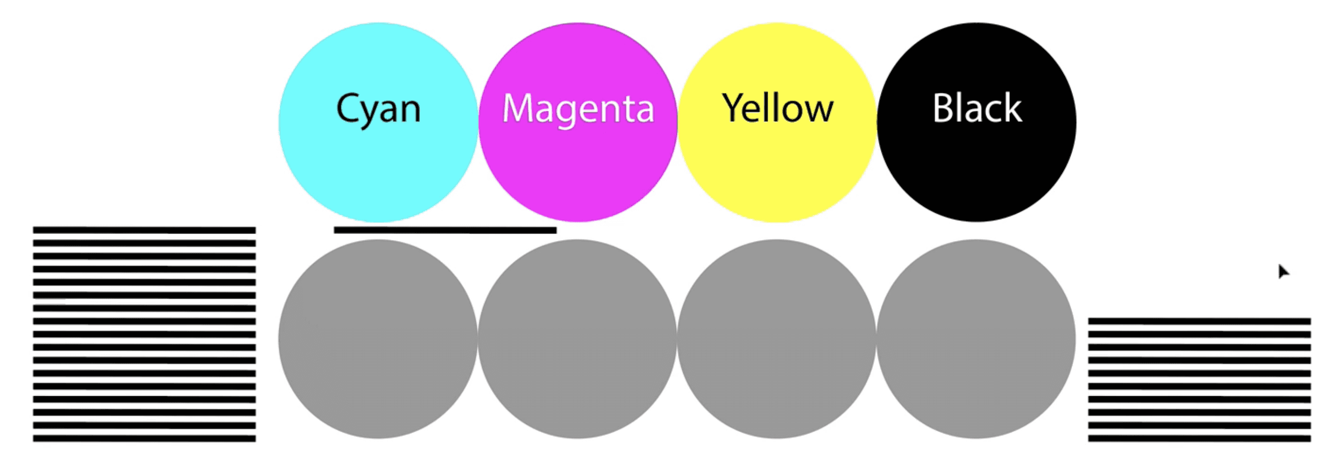
On the left is a huge stack of paper that is fed through the machine where the inks are applied. Unlike a home or office inkjet printer, much larger sheets of paper are used, meaning that several pages can be printed on one sheet, to be trimmed down later. This is what the thin lines are that you might have seen on a pdf or a proof:
Once the paper has gone through the printing machine, the paper is put into a commercial guillotine, where a blade is lined up with the thin black trim marks, and cut to size. Because you're printing on a larger sheet of paper than the final cut size, it's possible to have your design printed right up to the edge of the paper. This is where bleeds are required.
About Bleed
If you've ever asked a printer for a quote to print something like a poster or flyer, you might have been asked "does it have bleed?" Below are two designs. The first one doesn't need bleed, but the second one does.

When the first document is trimmed it doesn't matter too much if the trimming is slightly inaccurate, as you'll likely only end up with a barely noticeable uneven border. But as the second document has a photo that extends all the way to the edge of the page, before it's printed that needs to be extended a few millimetres more. This is so that if there is any inaccuracy when it's trimmed you don't end up with a very noticeable white border at the edge:

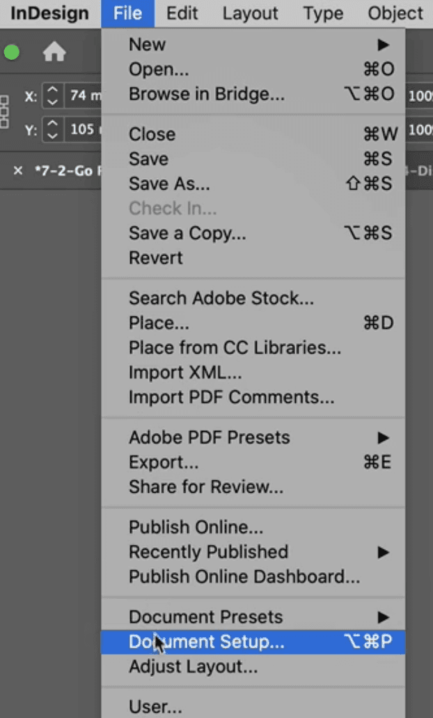
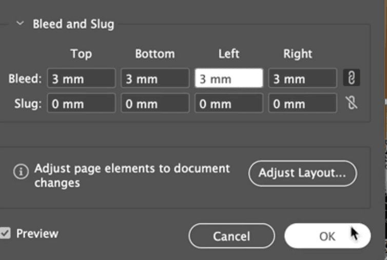
How to add bleed in InDesign
From the File Menu choose Document Setup. Insert 3mm bleed values (unless your printer gives you a different value to use):
Notice the subtle red line that appears around your document. This is a bleed guide: it shows you the area into which you need to extend any images or areas of solid colour, so that they won't be trimmed off:
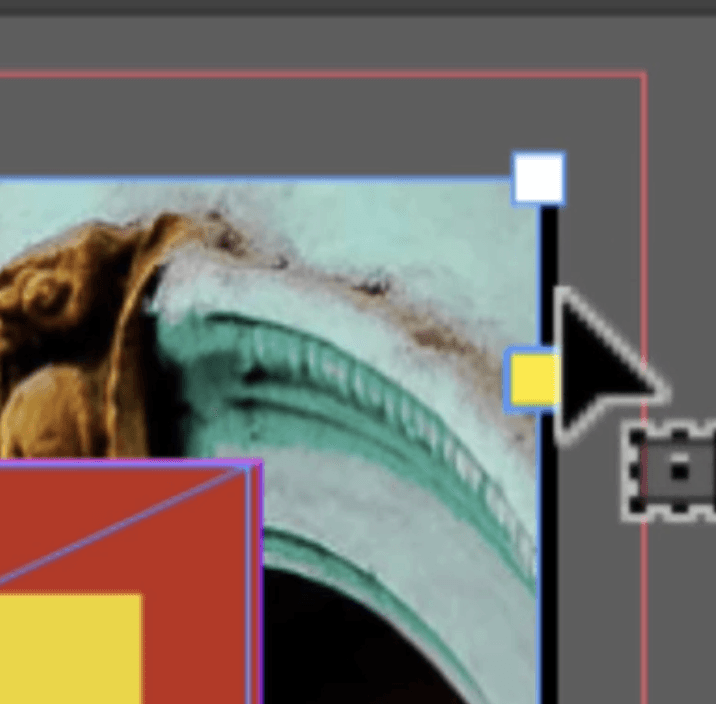
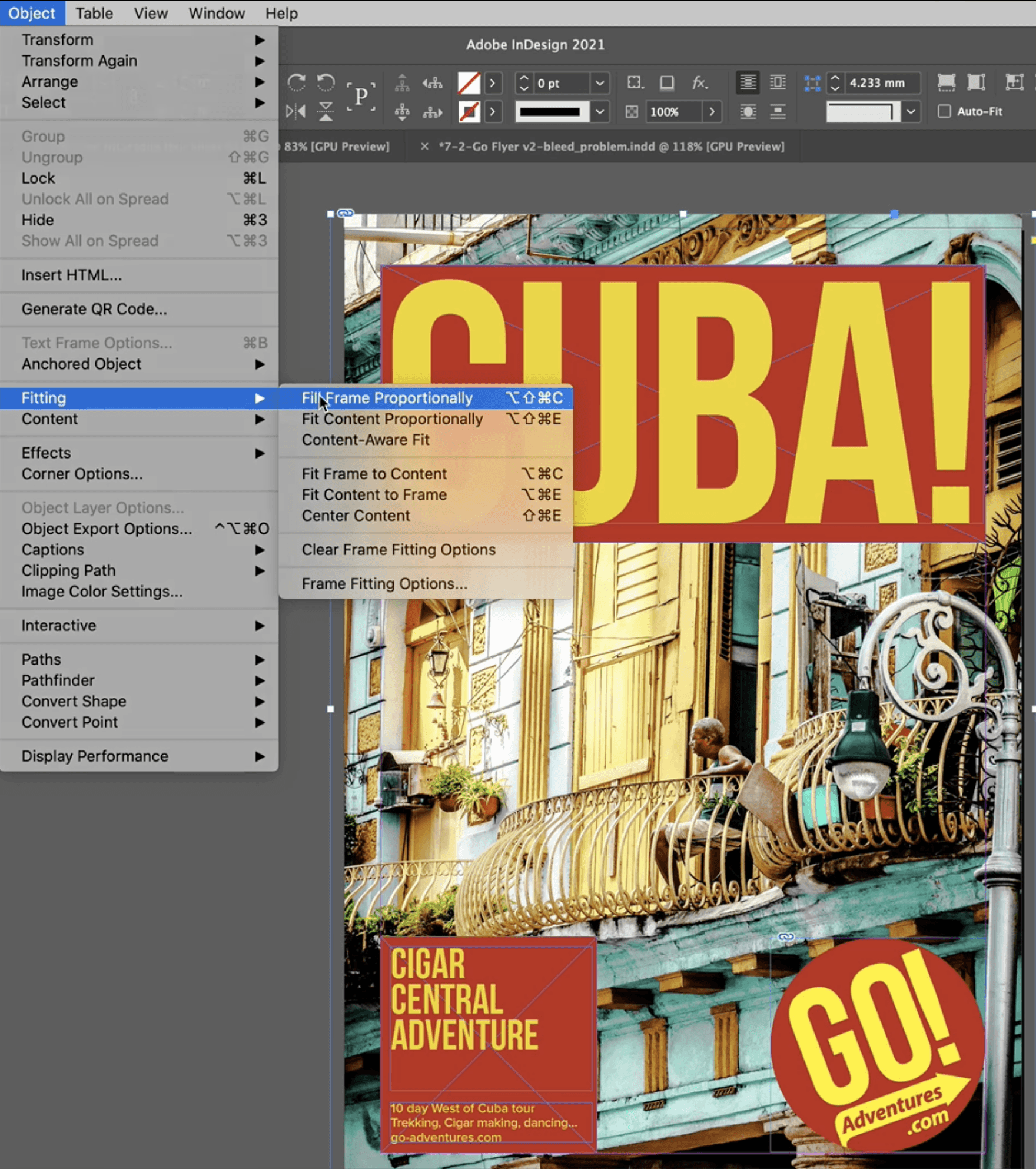
Now you need to adjust the image frame so that it lines up with the bleed guide. Do this for every corner, then choose Object > Fitting > Fill Frame Proportionally to make the image fill the newly enlarged frame:

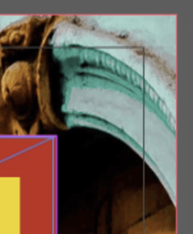
See the close-up image of the edge of the frame with the bleed correctly added:
NB When you create the pdf you'll need to make sure that the bleed area is included. See the Create a pdf for commercial printing section.
About Links and Missing Images
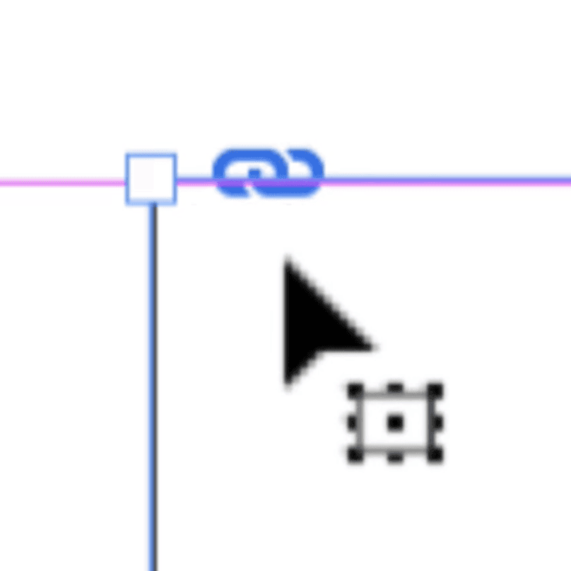
When you use File > Place in InDesign to import an image, the image is Linked. This means that InDesign knows where the original image is located on your computer or network. You can see that an image is linked when you see this blue chain link icon at its top right:
Why is this important? Because when you import an image, InDesign only actually brings in very low quality version of the image (known as a thumbnail) to save on processing power. There are only a few occasions when InDesign uses the full quality image, and the most important is when you create a pdf. But to get a sense of what we're talking about, if you change your Display Performamce settings in the View Menu you'll see the difference between a the full quality image and the thumbnail (this example shows a vector graphic, so the effect is more dramatic than usual):
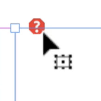
If you change the location or filename of an image after you've placed it in, or if someone sends you an InDesign file without sending the images too (see Package, below, for the correct way to do this), InDesign won't know where the original image is. It tells you that by showing a different icon at the image's top left:
To fix it, you'll need to know where the original image is, and either use File > Place to reimport the image, or use the Links Panel. This panel is useful for longer documents as it shows you all the links in the document in one place:
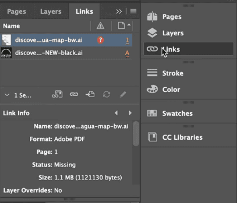
Notice the red warning icon that appears on the image at the top of the list: this shows that the image is missing. You can double-click on this icon to relink the image.
About Low Resolution Images
You're probably aware that digital photos are made up of thousands or millions of pixels, which are tiny individual blocks of colour. The number of pixels present per inch defines the image's resolution.
Before you send your InDesign document to be printed, you want to be sure that the resolution of each photo is high enough. Another way to say this would be "are there enough pixels in this image to look ok at the size I want to print it?"
If that sounds like an impossible question to answer, it's actually really straightforward if you know where to look in InDesign.

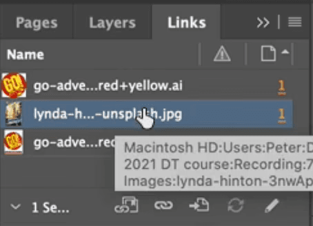
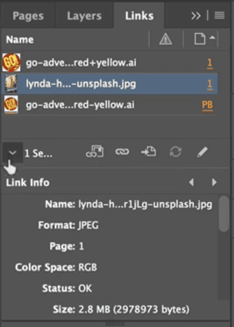
To check whether the resolution is ok for the large background image on this poster, firstly you select its frame with the Selection Tool. Then you need to open the Links Panel, and click on the arrow to show the Link Info:
The Link Info shows useful information about the selected image. What you're interested in is the PPI, which means "the number of pixels per inch". The Actual PPI refers to the image at it's original size, but the Effective PPI is what's useful. Because it shows the resolution of the image at the size you've used it:
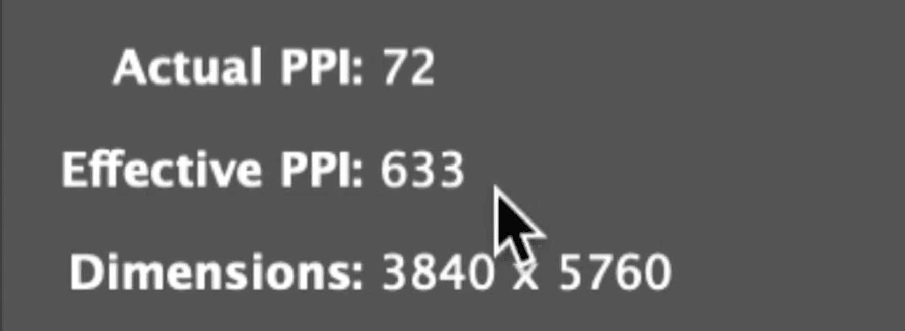
You're looking for a number over 300, ideally. Most images you're likely to import, so long as they come from a modern camera, should be fine. If the number is much lower than 300 you could either choose another image, or try redesigning you document and using the same image at a smaller size.
Dealing with missing fonts
Below you'll see a screenshot of how this social media post should appear [like all these documents, something you'll create in Graphic Design for Marketers]:

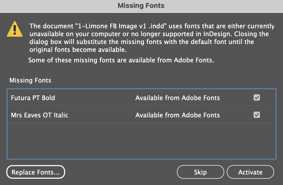
Sometimes, however, when you first open a document in InDesign you'll see that the text looks very different. The pink highlight shows that there are fonts missing:

What does missing fonts mean? It means that the fonts that was used when the document was designed aren't installed on your computer. To be able to work properly with the document, and especially when you want to send the document to be printed, you will need to have those fonts installed.
How you'll do that depends on whether the fonts are available on Adobe Fonts, part of Adobe's Creative Cloud that also includes InDesign. If when you first open the document you see a warning like the one below, this is showing you that these fonts are available on Adobe Fonts, and you can temporarily install them by clicking the "Activate" button:
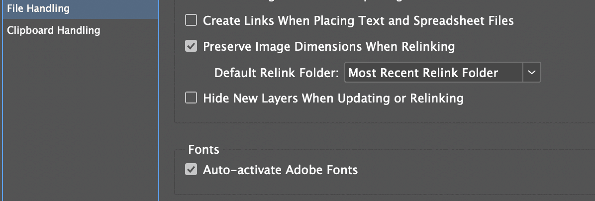
If this is something you've never seen, it's likely that automatic font activation is set InDesign's File Handling Prefererences:
Once you've activated the fonts they should be installed on your computer – in the background, possibly after a short delay:

If the missing fonts are not ones that are available on Adobe Fonts, then you'll have to get the fonts installed on your computer manually. The first step to do this would be to get a list of the missing fonts, which you'll find in Type > Find / Replace Font. Then you'll want to talk to your IT department / colleague / designer and get them to send you a copy of the fonts, or possibly buy them. Once on your computer, double click on the fonts to installing them.
Creating a pdf for a commercial printer from InDesign
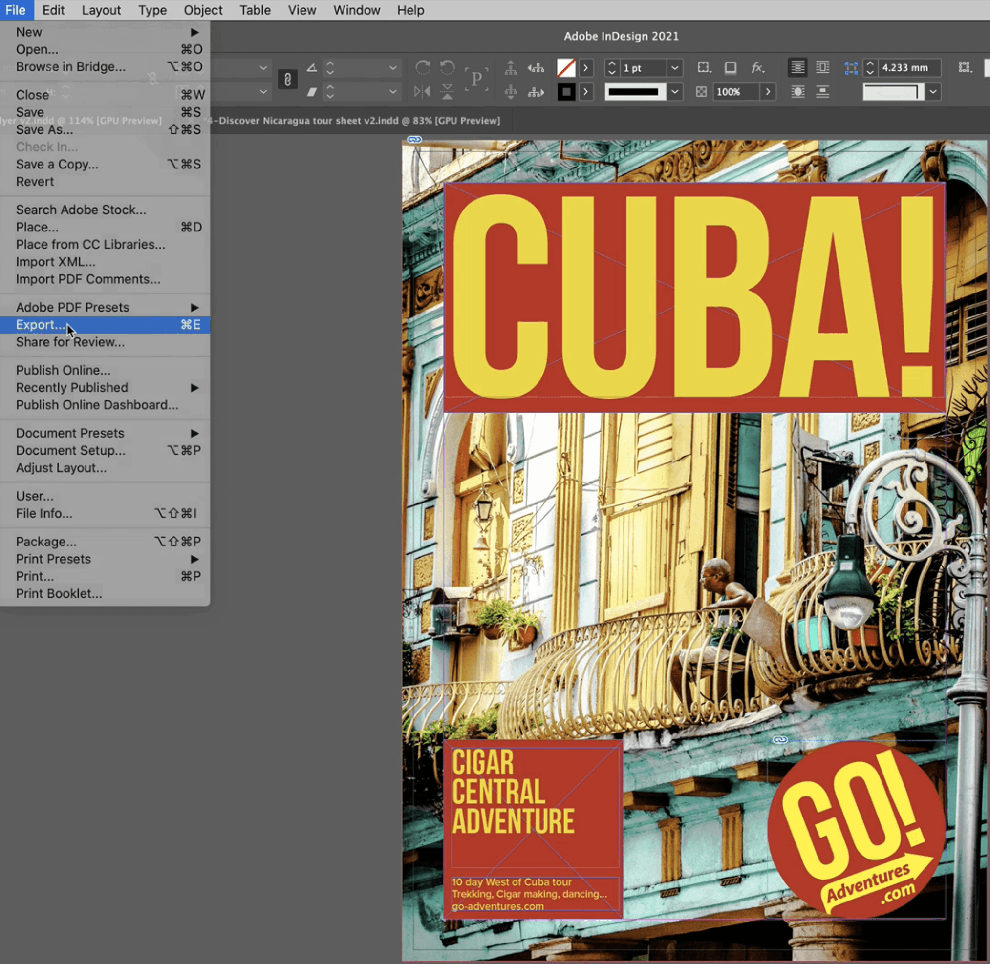
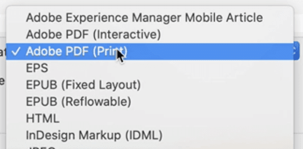
Once you've made all the checks above, and anything else your printer advises you to check, it's time to make the pdf that you're going to send them. To do that, from InDesign's File Menu choose Export, then Adobe PDF (Print):
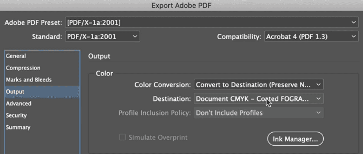
There are numerous settings you can choose. If your printer suggests some I'd recommend going with their suggestions. But in the absence of that, this is what I almost always choose the [PDF/X-1a:2001] preset.
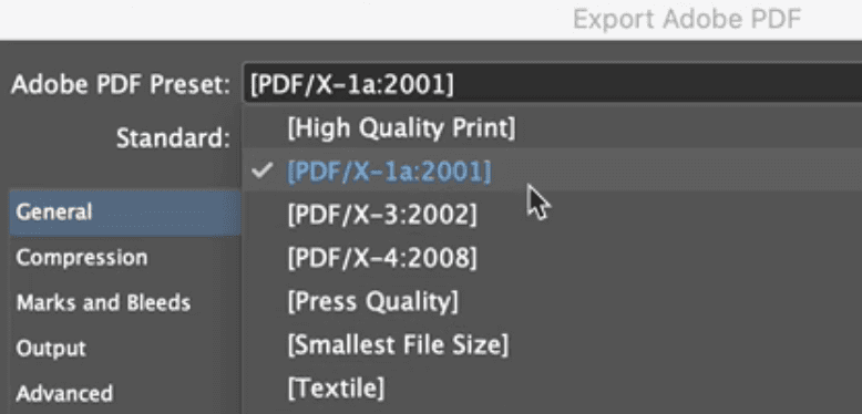
The main reason I do this is because I know that it will convert any RGB images to CMYK as it's making the pdf (photographic images usually are made from pixels that contain Red, Green and Blue values and need to be converted to pixels that are made from Cyan, Magenta, Yellow and blacK).
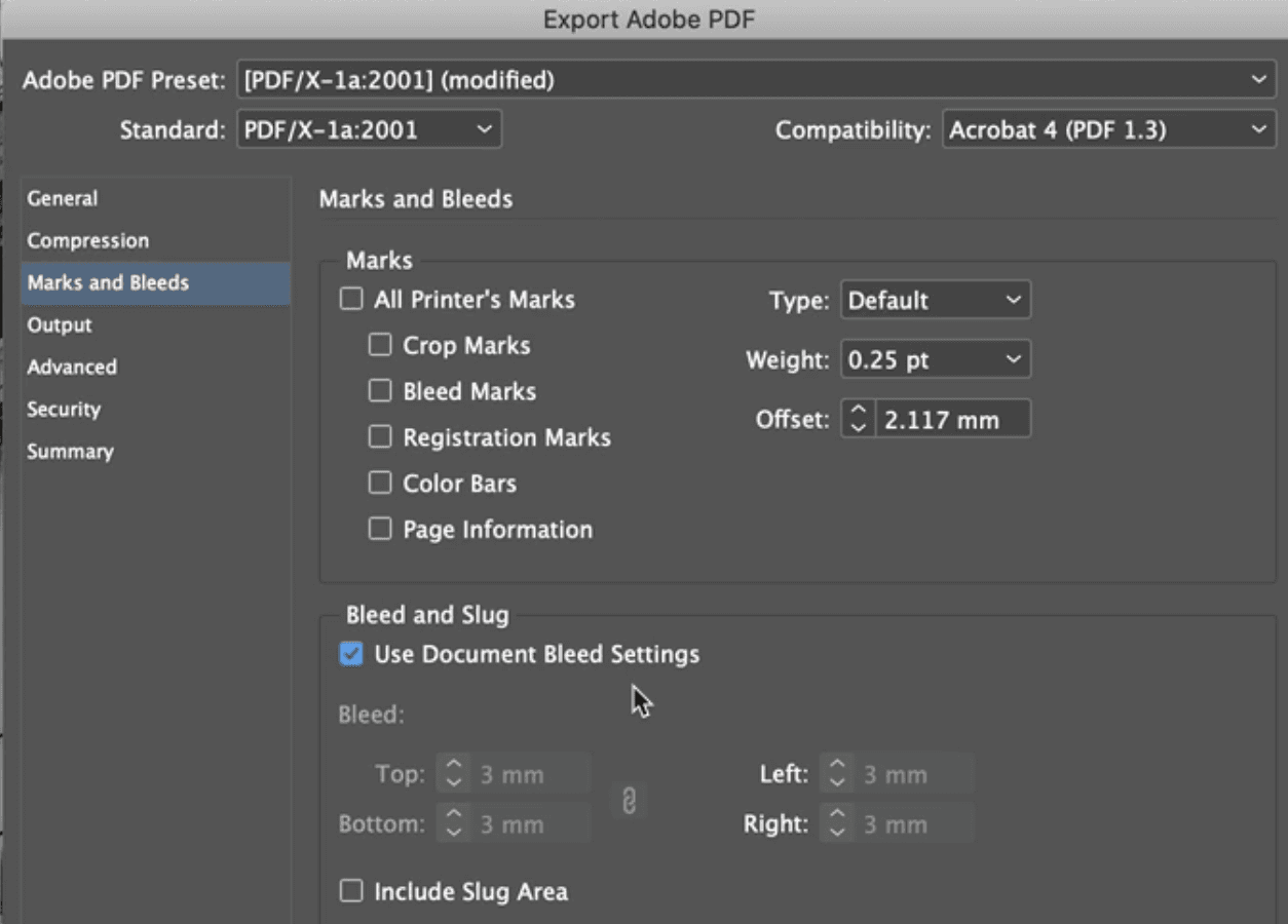
You have two options to consider. The first is whether you want to include any bleed that you've previously set up. In the case of the document we're looking at, this is what we'd want to do, so we'd press under "Marks and Bleeds" check the "Use Docuement Bleeds Settings" checkbox:
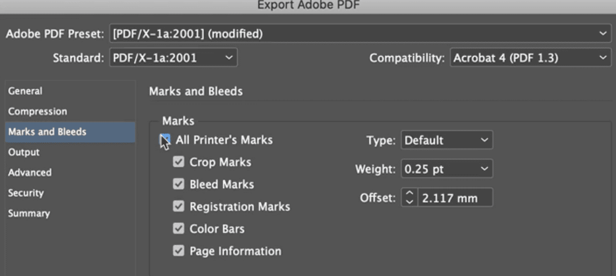
The second option is to choose whether you want to include "Printer's Marks". These add on useful elements to the PDF for your printer, like Crop Marks and Colour Bars (see second image below):

This finished pdf takes us back to where we started. Hopefully you can imagine several of these lined up on a large press, several printed on large sheets of paper that then get trimmed down using the Crop Marks to create the finished flyer.
Hopefully this gives you an understanding of the commercial print process so you can be more confident sending your InDesign file to a printer. If you like this approach – to understand in order to grow in confidence – then please consider trying out our flagship course, Graphic Design for Marketers. You'll grow in confidence in your use of the Adobe programs as you create things like flyers, newsletter, social images, animations, infographics and much much more.
Read our other guides to InDesign
Explore our Graphic Design for Marketers course